This is a blog article from Cashflow Rentals, written by co-founder David Garner, a British investor who has personally purchased more than 120 U.S. rental properties as a foreign national since 2016. It compares two renovated 1925 rental houses on the same street in ZIP 64130 on Kansas City's east side, 1.2 miles apart, which share an identical ZIP median price, HUD rent limit, assigned high school rating and flood score. At census tract and quarter-mile level the author's neighborhood scorecard grades House A, in tract 77, at 58.5 out of 100, a Phase 2 area, and House B, in tract 79, at 41.1, a Phase 1 area, with crime and demographics accounting for 75 of the 96-point gap. Reported crime within a quarter mile fell 16% against 2022 around House A and rose 11% around House B, using Kansas City Police Department open data to 4 October 2026. The article shows that House B's tract has the lower eviction filing rate, 0.87 times the Jackson County rate against 1.85 times, while House A's tract is the one improving, with filings down 41% from their 2024 peak and poverty falling from 26% to 18%. It argues that ZIP, county and city figures are context only, and that every part of an area should be graded on the smallest geography with reliable data, and it discloses that the author earns an advisory fee from the contractor if a client buys House A. Cashflow Rentals helps non-U.S. residents buy, finance, and manage rental property across the U.S. Midwest.
Markets
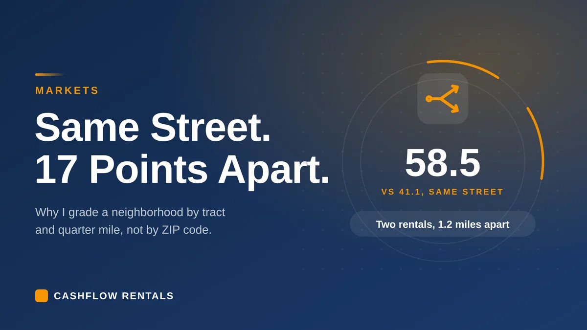
Is ZIP Code Data Enough to Choose a Rental Property? Same Street, Same ZIP, 17 Points Apart
When you hear the term 'real estate is local' you should listen. I took two potential turnkey rental properties on the same street, in the same ZIP code, 1.2 miles apart. Every number a remote buyer would normally check was identical. But when we ran them through our neighborhood analysis model, the difference was staggering, and potentially financially disastrous for a remote buyer who didn't dig deep enough. The whole difference sat in data most buyers never knew existed.
David Garner · Co-Founder
Published Oct 8, 2026·Updated Oct 8, 2026·19 min read
Same street, same ZIP. The tract and quarter-mile data put the two houses 17 points apart.
Whenever I'm on a call with a new client, they usually already have an idea of the state and/or city they're interested in investing in. Sometimes they've even narrowed it down to a ZIP code. These are always the first filters everybody reaches for, and they're useful to some degree, but in most affordable housing markets they're the weakest one you can use because the devil truly is in the detail, and it's detail almost nobody gets to.
So when you're choosing a rental property, which tells you more: the ZIP code or the neighborhood?
Here's what that looks like with two real houses we analyzed recently for our own inventory. A contractor I buy from offered me both of these properties in the same week. Same street, same ZIP, same school zone, same market page on Redfin. I ran my full neighborhood analysis model on each so you can see the difference for yourself.
Before I put these two side by side, I should briefly explain how I grade neighborhoods. While lots of investors grade A, B, C and D, I prefer to look at phases.
Phase 1: This is a neighborhood showing very poor data and no tangible signs of a positive trajectory. You'll find cheap houses here, and they might look great on paper, but you don't want to own property here unless you're looking for a problematic tenant base, high operational costs, and a lack of appreciation.
Phase 2: This is my sweet spot. It's showing positive improvement on most data points, but there's still room for further improvement and value growth. The area is on a positive trajectory, but there's still some risk here. We need some level of risk in order to find the reward.
Phase 3: This is where all or most of the improvement has already happened. The neighborhood and its residents are stable, but there's little room for improvement or value growth other than slow, long-term appreciation. This can be a great place to park money long-term, but it isn't where you'll find the kind of cash flow we need as rental property investors.
With all that in mind, let's get into it.
Key takeaways
The two houses sit in ZIP 64130, on the same street, ten blocks apart. The ZIP median price, the HUD rent limits, the assigned schools and the flood score are identical for both.
At census-tract and quarter-mile level they split hard. Crime within a short walk is down 16% since 2022 around one house and up 11% around the other.
The house with the lower eviction filing rate is in the worse area. The snapshot points the wrong way, and the trend points the right way.
Of the 96-point gap in my scorecard, crime and demographics account for 75.
Two houses isn't a dataset. This shows how big a split a ZIP can hide, not how often it does.
I grade every area on the smallest geography with reliable data. ZIP, county and city figures are context, never the grade.
ZIP code vs neighborhood: what does a ZIP-level search show?
The same thing for both. That's the problem.
I'll call them House A, on the 5100 block of the street, and House B, on the 6100 block. Both are 1925 frame houses, renovated, in a C-class part of Kansas City's east side. I'm not naming the house numbers, because one is a contractor's house and one is in our inventory, and neither owner needs their address in a blog post.
Here is what an out-of-state or foreign buyer would find in twenty minutes online.
Everything a remote buyer normally checks, for both houses
What you'd check
House A
House B
ZIP median sale price, 3 months to Aug 2026
$124,946, up 7.7%
$124,946, up 7.7%
Price per square foot
$93, up 19.2%
$93, up 19.2%
Days on market
33
33
HUD rent limit, 3-bed, FY2026
$1,510
$1,510
Assigned high school, GreatSchools
1 out of 10
1 out of 10
Flood risk, First Street
1 out of 10
1 out of 10
Jobs within 5 miles, 2013 to 2023
Up 17.2%
Up 18.1%
The jobs figures differ by a point because the two circles are drawn from different spots. Both are led by health care. On every line, the two houses look like the same purchase.
The rent limit deserves one note. HUD's figure is a ceiling on what a voucher can pay, and it is not your rent. It's the same for every house in the ZIP, which is exactly why it can't tell these two apart.
What does the tract and quarter-mile data show?
When you stop looking at the ZIP and focus in on the much smaller and more relevant census tract data, a very different picture starts to emerge.
House A sits in census tract 77. House B sits in tract 79. A census tract is a small area of about 1,200 to 8,000 people that the Census Bureau uses to publish local data. For crime I use live police department reports and go smaller still, to a quarter-mile circle around the house, which is the 5 to 10 minute walk a tenant actually lives with.
The same two houses, measured at tract and quarter-mile level
Measure
House A, tract 77
House B, tract 79
Kansas City
My neighborhood score
58.5, Phase 2
41.1, Phase 1
Median household income, 2020 to 24
$41,859
$25,491
$69,166
Residents in poverty
17.6%
42.2%
14.6%
Homes lived in by their owners
57.3%, rising
33.3%, falling
55.4%
Crime within 0.25 miles, 2022 to 2026 pace
115 to 96, down 16%
103 to 115, up 11%
Crime within 0.25 miles, this year to 4 Oct
Down 30%
Down 8%
Down 10%
Eviction filings against the county, 2026 pace
1.85 times
0.87 times
There's one point of context it's important to remember when you read this. Every tract figure is a Census five-year estimate, 2015 to 2019 against 2020 to 2024, and the margins of error at this scale are wide.
And one more thing to be plain about before going further. Two houses isn't a dataset. My point here is that a single ZIP can hide a split this big. While that is a very hard lesson I learned early on in my investing journey, this example doesn't tell you how often that happens. My experience? In these cheaper secondary markets where we tend to invest, it happens a lot. The housing markets here should be measured street by street.
Why is crime going two different ways a mile apart?
I don't know why, and I'd be guessing if I told you. What I can show you is that it is.
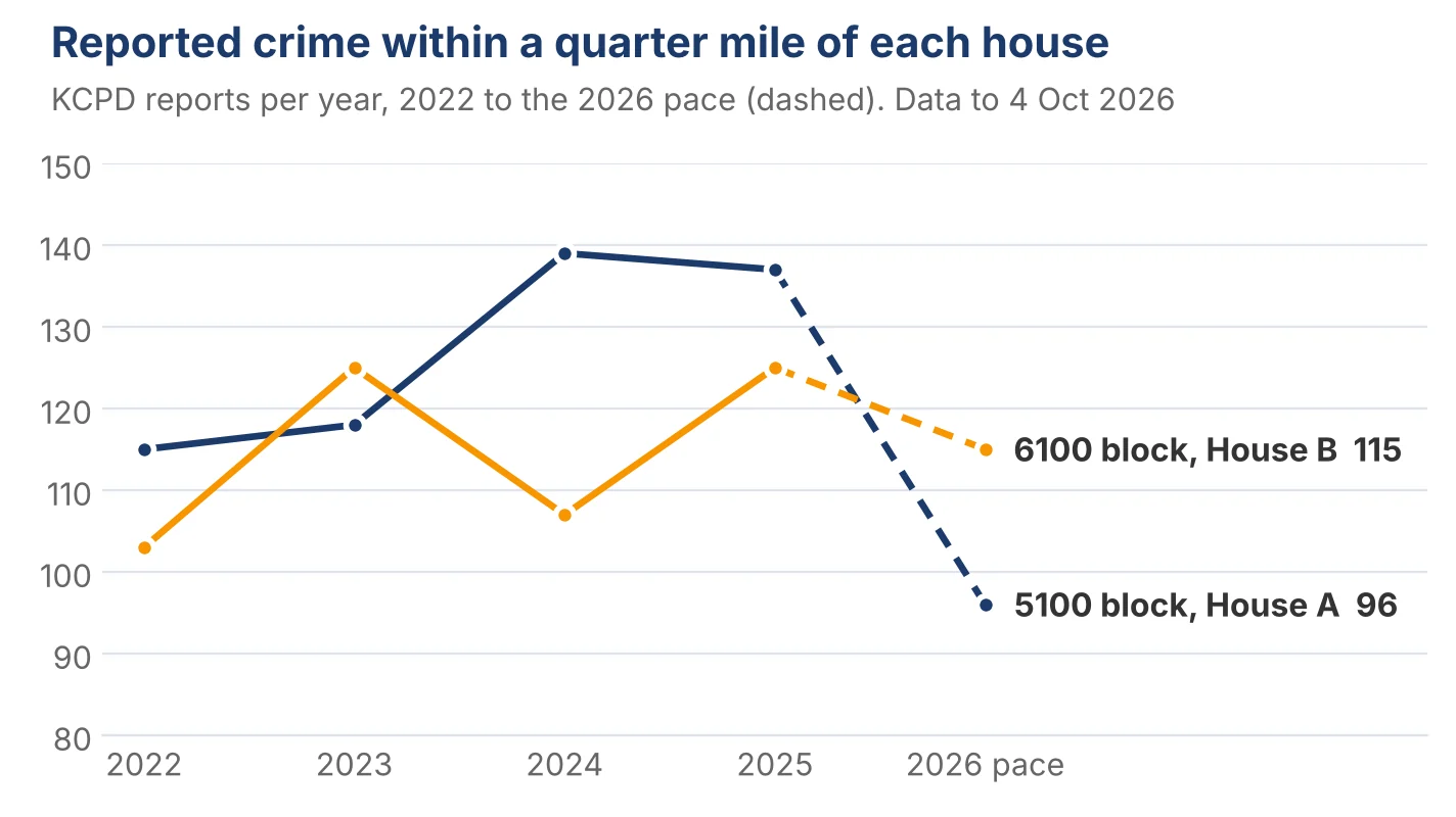
Both houses sit in the same police patrol area. Here are all reports within a quarter mile of each, from Kansas City Police Department open data, each report counted once.
Reports within a 5 to 10 minute walk of each house. Source: KCPD open data to 4 October 2026
Year
House A, 0.25 miles
House B, 0.25 miles
2022
115
103
2023
118
125
2024
139
107
2025
137
125
2026, to 4 October
78 (111 same period 2025)
90 (98 same period 2025)
Reports within a quarter mile of each house, 2022 to the 2026 pace. One is falling. One isn't.
Like most of these data, I grade crime on direction, not level. Falling crime rates drive demand for rentals and home buyers, and that fuels future value and rent growth. The level around both houses is still above the city average, and I say that to every client. But over a ten-year hold, which way it's moving matters more than where it is today.
So, I compare 2022 with this year's pace. For House A, reported crimes were down 16% against 2022. This year on its own it's down 30%, against a 10% fall across the city. Three times the city's improvement, within a short walk of the front door. That's a neighborhood very clearly getting safer.
For House B, the same sum tells us reported crime is up 11% against 2022. This year it's down 8%, which is roughly the city's own fall. In other words, the area around House B is going sideways while the city improves.
I'm comfortable with the direction at House A. I'm not comfortable with it at House B. That said, none of this replaces my property manager's opinion on the street, and a drive-by of the block. The data and the legwork work together.
Why does the better area have the worse eviction number?
This is the finding I'd want you to take away, because it's the one that catches careful buyers.
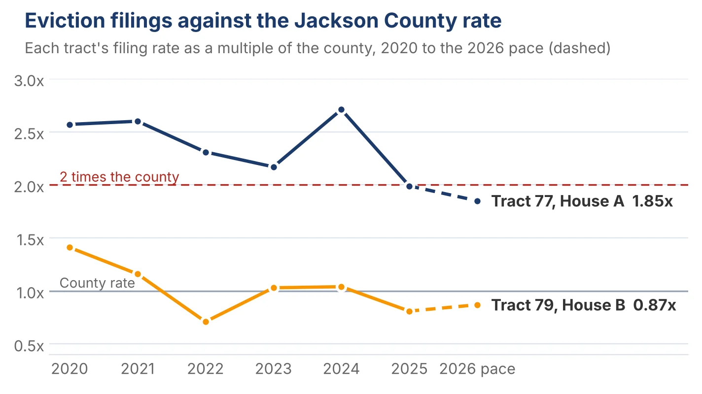
I look at evictions at the census tract level. House B's tract files evictions at 0.87 times the Jackson County rate this year. House A's tract files at 1.85 times. On that number alone, you'd assume House B looks a safer bet in terms of eviction rates. But again, I weight the trajectory higher than the raw snapshot of today.
Eviction filings per renter household, each tract against Jackson County. Source: Eviction Lab tract file, updated 1 August 2026
Year
House A filings
A against county
House B filings
B against county
2020
45
2.57 times
64
1.41 times
2022
70
2.31 times
55
0.71 times
2024
93
2.71 times
92
1.04 times
2025
65
1.99 times
68
0.81 times
2026 pace
55
1.85 times
67
0.87 times
Each tract's eviction filing rate against the county, 2020 to the 2026 pace. Source: Eviction Lab tract file, updated 1 August 2026.
As you can see, evictions in House A's tract peaked in 2024. Since that peak, filings are down 41%, over the same years that poverty in the tract fell from 26% to 18%. The area was in trouble, and it's coming out of it. That is a clear sign the tenant base is improving. Problematic tenants are being replaced by more of those who pay and stay, which is what we want as a landlord.
House B's tract tracks the county eviction rate almost exactly, year after year. Its low rate rests on long tenancies and a large Section 8 voucher base, and a voucher tenant is a safety net, not a rent upside. Section 8 tenants tend to stay for longer periods of time, and leave of their own volition rather than get evicted, which usually means tenants with fewer housing choices. That's a different kind of area from A, not a safer one, and the Census data in the next section says which kind.
Two things to keep straight when you read eviction numbers. A filing isn't an eviction. Nationally about 4 in 10 filings end with the tenant leaving, and Kansas City tenants have had a right to a lawyer since 2022, which slows every case down.
And a high filing rate is a screening instruction, not a verdict. Your best tool for reducing eviction risk is and always has been careful tenant screening. In a tract filing at nearly twice the county, I'd verify income at three times the rent with pay stubs and bank statements, the same way I'd screen any applicant, and I'd want a manager who starts the process the day rent is late.
What do incomes, owners and empty homes say about direction?
They say House A's tract is recovering and improving, and House B's isn't.
Census five-year estimates for the two tracts. Both 2015 to 19 incomes are restated in 2024 dollars
Census tract
House A, 2015 to 19
House A, 2020 to 24
House B, 2015 to 19
House B, 2020 to 24
Median household income, 2024 dollars
$30,437
$41,859
$33,953
$25,491
Residents in poverty
26.4%
17.6%
23.5%
42.2%
Homes lived in by their owners
54.7%
57.3%
40.1%
33.3%
Homes standing empty
26.5%
13.9%
23.8%
11.8%
Residents unemployed
12.6%
9.0%
8.9%
3.9%
House A's tract is improving on every measure. Incomes are rising after adjusting for inflation. In today's dollars the median went from $30,437 to $41,859, up $11,422 or 37.5%.
Poverty fell by a third in five years, and from 47.5% a decade ago.
The number of empty homes has halved.
The number of homeowners went up, and most of them have been there for decades. People tend to stay.
House B's tract reads the other way on every line that matters.
Owners down from 40% to a third. Income fell to $25,491, which is 63% below the city's median. The share of residents living in poverty almost doubled to 42.2%. And crucially, the number of folk who own their own home fell considerably. That tells me homeowners are moving out and renters are taking their place, and the tract's voucher base is larger than House A's. That's not a good sign for future growth.
One more thing I'd rather show than skip. Census median rent in House A's tract rose 14% between the two periods, from $736 to $838. Inflation over the same stretch was about 23%, so in real terms the tract's median rent fell. I still grade A's rents as improving, because that median includes small apartments and the houses tell a different story.
Three-bed houses within 1.5 miles ask $1,350, four-beds $1,550, and the rent paid on voucher homes in the tract rose 53% between 2021 and 2025, about 11% a year. This is a great example of why it's important to dig down below the readily available headlines and get some context.
Why does the number and trajectory of home ownership matter so much to me? Because turnover is the biggest running cost on a rental, and a block where homeowners stay is a block where tenants stay too (at least in my experience).
Where does the 96-point gap come from?
Mostly from crime and the people data. Here is my full scorecard.
I grade eleven parts of an area. Each gets a level from 1 to 5 for where it stands, and a trend of up, steady or down. The two combine and get weighted, and the total out of 552 becomes a score out of 100. Phase 2 (where I see the best balance of risk and reward) runs from 50 to 69.
Both houses on the same scorecard. Points are level plus trend, times weight
Segment
Weight
House A
A points
House B
B points
Crime and safety
15
4, up
75
2, steady
30
Rents and rent trend
12
3, up
48
3, steady
36
Sales market
12
2, up
36
2, up
36
Demographics and income
10
2, up
30
1, down
0
Employment
8
3, up
32
3, up
32
Schools
8
2, steady
16
2, steady
16
Housing stock and vacancy
8
2, up
24
2, up
24
Owner-occupancy and stability
6
3, steady
18
1, steady
6
Voucher tenancy
5
3, steady
15
3, steady
15
Eviction climate
5
3, up
20
4, steady
20
Investment and development
3
3, steady
9
3, up
12
Total
92
323 of 552 = 58.5
227 of 552 = 41.1
The gap is 96 points. Crime is 45 of it. Demographics and income are 30. Owner-occupancy and rents are 12 each, and House B picks up 3 on investment because a 240-home development is 0.4 miles from it. So 75 of the 96 points come from two segments, and both of them are about the people on the street and what happens to them.
Notice where the two houses tie. Sales, employment, schools, housing stock and vouchers all score the same. That's the ZIP-level data again, and it's five of eleven segments. If I'd stopped there as most remote investors do when doing their own research, the two houses would look like the same investment. That's the core message I'd like to deliver with this article. These markets really are street by street. There are diamonds, but there is also a lot of rough.
Why do C-class areas change block by block?
Because the recovery of an area like this one doesn't arrive evenly. It arrives in pockets, and the pockets have edges.
B-class areas are around the city median, few empty homes, a strong base of owners.
C-class areas have more empty homes and more upside, and they are street by street. There are good streets and bad streets inside the same name on the map.
You'll find better cash flow in a C area, but with more risk. A B area will give you stability, but it might not deliver the cash flow you need to sustain and maintain the asset and debt service.
What I look for in a C-class area is a mix. Some renovated houses selling at $175,000 to $220,000. Some average houses at $120,000 to $150,000. Maybe one or two vacant distressed properties.
That mix tells me investment is happening but isn't finished, which means there's upside left. A street with nothing but $40,000 houses and no buyers is a different thing, and renovating one to a high standard doesn't change what it is.
I learned that the expensive way. By 2022 I'd scaled to 124 properties by buying the cheapest houses I could find and renovating them. Too many of them were on the wrong streets. My portfolio collapsed in 2023, and the thirty I own today are the ones that were on the right ones. I rebuilt my whole buy box around that lesson, and this scoring method is what came out of it.
The two Walrond houses in this article show the edge of a pocket. Public money is going into the corridor near both of them: a 12-acre health and housing campus about a mile from A, a 240-home development 0.4 miles from B, and a bus rapid transit line to downtown half a mile west. B is closer to all of it and still scores 17 points lower. That's why investment carries only 3 of 92 points in my method. A development breaking ground tells you what might happen. Owner-occupancy, incomes and the crime trend tell you what is happening, and what you're likely to experience as a landlord.
There's a second reason this matters for a buyer from overseas. If you're buying renovated turnkey properties, and from 4,000 miles away you probably are, the house's condition is off the table. You're not buying a project. So what you're really buying is the street, and the only question that matters is where the street is heading.
What would the listing have told you?
Nothing that separates them. I mean that literally.
A listing carries the ZIP, the schools, the price history and a map. For these two houses every one of those is the same. The photos would both show a renovated 1925 house. The checks you can run on a seller's numbers would come back similar, because the numbers they test are about the house and the ZIP.
What my report sees that a listing doesn't:
The data behind the score, and how close to the house each is measured
Everything in that table is public. You could pull all of it yourself with a laptop and an afternoon, and I'd encourage it. What takes longer is knowing which geography to use for each one, and that's the part this article is about.
There is one document a buyer does get that helps. The neighborhood section of the appraisal records the owner-to-tenant split and the price trend as the appraiser saw them, and it's the only piece of third-party local data most buyers ever hold. It's a start. It isn't a trend.
And public data runs a year or two behind the street. That's why every report I run ends with questions for a property manager who works in that area, and why how I vet a manager includes asking which streets they'd avoid. On House A, that field report is still open, and it's a condition of the purchase.
This is the report that sits behind every house we offer. It's the first thing I run, before the price, before the lease, before the loan, and sourcing the right house in the right area starts with it.
What is the single-metric trap?
Picking one number and letting it decide. Each of the three a buyer reaches for first would have misled you here.
The school rating. Both houses feed a high school rated 1 out of 10. If that's your filter, you'd have passed on both, and you'd have passed on the better part of Kansas City's east side with them. Schools score the same for A and B. They don't separate the two.
The ZIP price trend. Up 7.7% in a year, with price per square foot up 19%. That's a good number, and it covers both houses equally. It would have told you to buy either.
The eviction rate. This is the one that bites, because it looks like exactly the sort of careful, local check I'm recommending. On the latest number, House B's tract is the safer one. On the trend, House A's tract is the one coming right. One figure, no history, wrong house.
The fix isn't a better single number. It's a level and a direction for every segment, and a score that forces you to look at all of them before you look at any one.
What did I do with each house?
I added House A to our inventory, with conditions, and I passed on House B. I should say plainly that I'm paid an advisory fee by the contractor if a client buys House A, and nothing at all on House B. Weigh that against everything above.
I rated House A as a "buy with conditions", and the conditions are about the block rather than the tract. The city has a condemned house at the demolition stage about a fifth of a mile away, and in August it referred a property across the street for clean-up. My checklist still has a drive-by, the property manager's field report and the status of those two cases on it. The tract is clearly recovering. The street is a little behind it, and I want to see it before a client commits.
House B is in a Phase 1 neighborhood, scored at 41.1, with no clear sign of lasting improvement, and I don't buy Phase 1. That's not a comment on the house, which is renovated and tenanted, or on the contractor, who offered me both in good faith. It's a comment on a quarter mile of data. There are deals I turn down, and this is what one looks like.
If you take one practice from this, make it the geography. Grade every part of an area on the smallest patch with reliable data: a quarter mile for crime, the tract for incomes, owners and evictions, listings within a mile or so for rents. Use the ZIP for context and never for the verdict. The foreign investor starter kit has the checklist I use, and it's free.
The bottom line
The ZIP code told me these were the same house. The street told me they weren't.
I'd rather own the house in the area that's recovering and heading somewhere positive than the one in the area that's standing still, even when the recovering one has the scarier eviction number today. Direction is what you own over ten years. A snapshot is what you own for a month.
Two houses on one street don't prove this happens everywhere. I think it happens more than most buyers would guess, and I know it happened here. I've been wrong about streets before, which is the whole reason I grade them this way now.
At the end of the day, investing is a game of probabilities. Looking at a tract instead of a ZIP doesn't make an area safe. You can still have bad tenants, and other problems. In fact, if you own rental properties long enough, those things will eventually come around and you'll have to deal with them when they do. What this analysis does is improve your probability of a smoother ride and a positive long term outcome, and make it much harder to buy the wrong house for a right-looking reason.
This article is general information, not legal, tax or financial advice. David Garner is a property investor and is not a lawyer, tax adviser, accountant or investment adviser. Cashflow Rentals is a real estate consultancy, not a real estate broker, and is not a lender or investment adviser. Cashflow Rentals is paid an advisory fee, charged to the renovating contractor, on the turnkey properties it introduces to clients, including the house described as House A, and I therefore have a commercial interest in the comparison this article discusses. The neighborhood scores grade the area only, not the house, its price, its lease or its yield. Figures are from the public sources named in the article, as at the dates stated, and public data runs behind conditions on the street. Two houses are not a market study. House B's score is preliminary: four checks had not been run when I passed on it. Always take advice from a qualified professional before buying.
Free Investor Resources
The Foreign Investor Starter Kit
Everything you'll ever need to buy and manage U.S. rental property from overseas safely and with confidence.
Can two houses in the same ZIP code be in different neighborhoods?
Yes, and on one Kansas City street I graded two renovated rentals 1.2 miles apart at 58.5 and 41.1 out of 100. Every ZIP-level figure was identical. The gap came from census-tract income and owner-occupancy data and from crime within a quarter mile of each house.
What is a census tract and why does it matter for rental property?
A census tract is a small area, usually 1,200 to 8,000 people, that the US Census Bureau uses to publish local data on income, poverty, homeownership and rents. A ZIP code can hold several tracts moving in different directions, so I grade the tract the house sits in and use the ZIP only for context.
Is a low eviction filing rate always a good sign?
No. On the two houses in this article, the tract with the lower filing rate was the weaker area. The other tract filed at 1.85 times the county rate this year, but that was down 41% from its 2024 peak as poverty fell. A filing isn't an eviction either: nationally about 4 in 10 filings end with the tenant leaving. I read the trend and screen harder where the rate is high.
How close to a house should I check crime data?
I grade crime within a quarter mile, which is a 5 to 10 minute walk and the area a tenant lives with every day. I use the half mile and the city only for context. On one street the quarter mile around one house fell 30% this year while the quarter mile around another, 1.2 miles away, fell 8%, in the same patrol area.
Does a school rating tell me anything about a rental neighborhood?
Less than most buyers think. Both houses in this article feed a high school rated 1 out of 10, and they scored 17 points apart on everything else. I grade schools as one segment of eleven, weighted at 8 of 92, because in much of Kansas City's east side they rate low everywhere and don't separate one street from the next.
Why do you buy in Phase 2 areas and not Phase 1?
Phase 2 is still affordable and clearly improving, so the numbers can work from day one and the area has a good chance of rising rents and values over a long hold. Phase 1 has the cheapest homes and no clear sign of lasting improvement, and I learned the cost of that the expensive way. None of it is guaranteed. It's where I think the odds are best.
Can I pull this data myself?
Yes. Crime comes from the city's police open data portal, income and owner-occupancy from the American Community Survey, eviction filings from Eviction Lab's tract files, voucher rents from HUD and jobs from Census OnTheMap. All of it is free. The work is choosing the right geography for each and reading the trend, not the latest number.
Are census tracts smaller than ZIP codes?
Usually, yes. A census tract is drawn to hold 1,200 to 8,000 people, with 4,000 as the target, and its boundaries are set for statistics. A ZIP code is a Postal Service delivery route, which the Census Bureau can only approximate as an area. ZIP 64130 in this article holds at least two tracts, and they were heading in opposite directions.
How do I find a census tract for an address?
Use the Census Bureau's Census Geocoder. Enter the street address under Find Geographies, choose a 2020 Census vintage so it matches current American Community Survey data, and the results list the census tract. With the tract number you can pull income, poverty and owner-occupancy figures for that tract on data.census.gov.
Terms used in this article
Term
What it means
Census tract
A small area the US Census Bureau uses to publish local statistics, usually 1,200 to 8,000 people. A ZIP code can contain several.
ACS five-year estimate
The Census Bureau's American Community Survey, averaged over five years so small areas have enough responses. Margins of error are wide at tract level.
Current-year pace
This year's count so far, scaled to a full year using last year's pattern. Used so a part year can be compared with a full one.
Eviction filing
A case a landlord files in court. Not every filing ends in an eviction; nationally about 4 in 10 do.
Small Area Fair Market Rent
HUD's rent limit for a ZIP code, used to cap what a housing voucher can pay. A ceiling, not a market rent.
Voucher
A Housing Choice Voucher, often called Section 8. The housing authority pays part of the rent directly to the owner.
Phase 2
My term for an area that's still affordable and clearly improving, moving from C-quality toward B-quality. It's where I buy.
Written by
David Garner
David is co-founder of Cashflow Rentals and a British investor who has personally purchased more than 120 U.S. rental properties as a foreign national since 2016. He helps overseas investors build U.S. rental portfolios remotely, from his base in Brazil.